

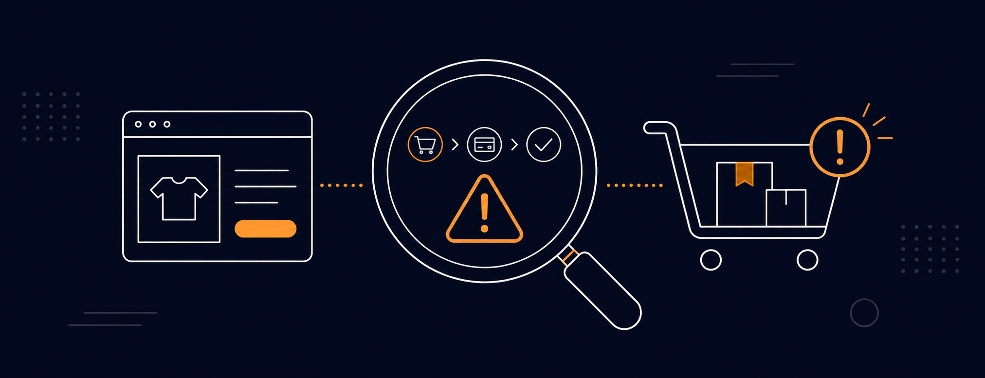
Every week, thousands of euros in paid traffic land on DTC stores that aren't ready to convert. The problem is rarely the product. The problem is friction: the small snags that make visitors hesitate, get distracted, and ultimately close the tab. Here are the seven most common mistakes and how to fix them without redesigning everything from scratch.
Your product page informs but doesn't convince
Your product page is your salesperson on duty 24 hours a day. If it only lists features, materials, and dimensions, you're doing journalism, not sales. Visitors don't come to your store to find out what the product has. They come to understand what it's going to change in their life.
Benefit-driven copy answers one question: "what's in it for me." Not "made with premium leather," but "a wallet that lasts more than ten years without losing its shape." Review the first two sentences of your description: if they don't solve a problem or project an outcome, rewrite them.
How to fix it: Rewrite the title and first paragraph with a simple structure: the problem it solves, the main benefit, and quick proof. Use your customer reviews as a source, since they already know how to describe it.
Shipping costs show up too late
Cart abandonment has many causes, but one dominates every study: the user reaches checkout, sees shipping costs for the first time, and leaves without buying. Last-step surprises destroy the trust built up over the entire funnel.
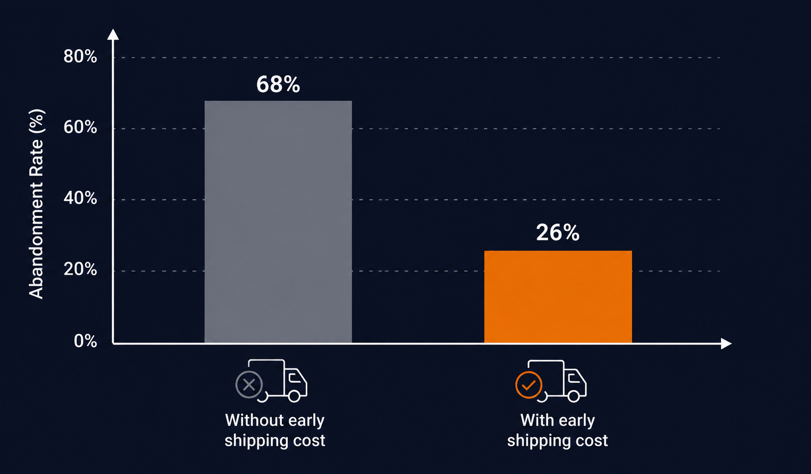
How to fix it: Show shipping costs on the product page, right below the price or the buy button. If you offer free shipping past a certain order value, add a progress bar in the cart. Early transparency consistently lifts cart conversion rate.
Your site loads slow and nobody waits
Google has published the data repeatedly: every extra second of load time cuts conversion rate by 7% to 20%, depending on the industry. On mobile, the patience threshold is under three seconds. If your store takes four or five seconds to show the first visible content, you're losing customers before they even see the product.
- Check your Core Web Vitals in PageSpeed Insights or the Google Search Console dashboard.
- Review the apps installed on Shopify: every app you're not actively using could be injecting scripts that slow down load time.
- Optimize your images: use WebP format and never upload anything over 200 KB uncompressed.
How to fix it: Uninstall inactive apps, compress images, and consider a well-optimized native Shopify theme before layering on customization.
Your CTA doesn't drive action
"Add to Cart" does its job, but it doesn't create urgency or emotion. "Get Yours Now," "I Want Mine," or "Start Today" are variants that, depending on context and product, can move the needle. The problem isn't always the copy: sometimes the button is buried below the fold on mobile and the user never sees it.
The best CTA is the one the user finds before they have time to hesitate.
How to fix it: The buy button needs to be visible without scrolling on mobile. Use a color that contrasts with the page background. Test copy variants with a simple A/B test in Shopify or a tool like Google Optimize.
No trust signals at the critical moment
The critical moment is right before clicking "buy." The user has their cart loaded and suddenly doubt creeps in: is this brand legit? will I get my money back if I don't like it? The buying impulse breaks in seconds if there's nothing backing it up.
- Verified reviews with photo or video above the fold on the product page.
- A one-line return policy summary visible near the CTA.
- Secure payment badges or recognized payment method logos.
- Units sold count or average rating, if it's high.
How to fix it: Place at least one real review, your return policy, and trust badges visibly on the product page without scrolling. Don't push them down to the footer. They need to be where the user makes the decision.
Operator Rule
If a potential customer has to go hunting for your return policy, you've already lost the sale. Put it where they don't have to look.
Checkout has too many steps
Every extra screen in the payment process is a chance to lose the customer. Requiring account creation before checkout can cut conversion by up to 35% in certain segments. Mobile users are especially sensitive to long forms and excess clicks.
Shopify has offered one-page checkout on all plans since 2023. If you're still using the classic three-step checkout, switching is probably the fastest conversion win you can activate today. Also enable guest checkout as the default option and offer account creation after the purchase, not before.
How to fix it: Turn on one-page checkout in Shopify Admin, enable guest checkout, and review your form fields, removing anything that isn't strictly necessary to process the order. Check out our guide on how to improve Shopify conversion without a redesign for more no-overhaul options.
You're not measuring the right things
"We get a lot of traffic" is not a business health metric. If you don't know where in the funnel users drop off, how long they spend on the product page before leaving, or which elements they ignore completely, you're making decisions on gut feeling, not data.
Tools like Microsoft Clarity or Hotjar are free or low-cost and show you real session recordings, heatmaps, and friction points. In ten session recordings of mobile users who abandoned their cart, you can spot two or three concrete problems that no aggregate metric would have flagged.
How to fix it: Install Clarity or Hotjar, filter for mobile sessions with abandoned carts, and watch the recordings. Back it up with event tracking in properly configured GA4 and Meta CAPI to get the full picture. The biggest enemy of conversion is rarely low traffic. More often it's the friction you've put in the way yourself.
If you want a quick audit of your funnel and a concrete action plan, let's talk, no strings attached. At ReadyCart, we audit product pages, checkout, and measurement to give you three priority changes you can execute this week.

Juan Jüncter
Founder & Operator · ReadyCart
Founder of ReadyCart. Builds Shopify stores, runs Google and Meta spend, and sets up the measurement that makes every decision verifiable.
Work with ReadyCart


Get tactics like this every week
Practical content for Shopify brand owners who want to grow with strategy, not luck.