

You open the dashboard, see seventy metrics, close the tab, and keep doing exactly what you did yesterday. If that sounds familiar, the problem is the dashboard, not you.
A good dashboard isn't the one with the most data. It's the one that tells you exactly what to change this week. That's what separates operators who grow from those who just measure.
The problem with data that doesn't drive decisions
Most Shopify stores have access to more data today than they did five years ago. Shopify Analytics, GA4, Meta Ads Manager, Klaviyo, Hotjar. There's no lack of information. What's missing is a toolset designed to answer a specific question.
The result is what product teams call analysis paralysis: so much data available that action gets postponed indefinitely. Traffic climbs, but revenue doesn't. Email open rates look great, but average order value drops. Without a clear framework, every metric sparks a conversation instead of a decision.
The solution isn't more tools. It's a dashboard designed with intent: what question it answers, who reads it, and how often.
Vanity metrics vs. metrics that matter
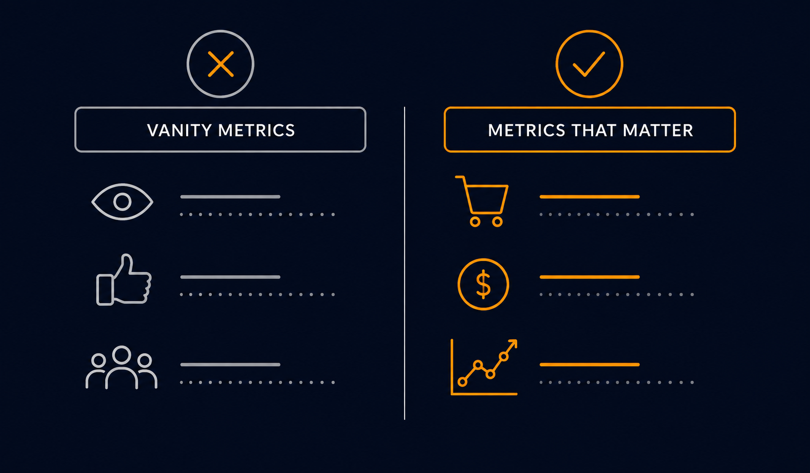
A vanity metric is any number that goes up and makes you feel good without telling you what to do. Unique visitors, followers, page views, impressions. They're not useless, but on their own they don't move the business.
An actionable metric is directly tied to a business lever. If it changes, you know exactly what to check and what to test. Concrete examples:
- CVR drops 0.4%: you check the checkout flow, page load speed, and CTA copy.
- AOV falls for three weeks straight: you adjust free-shipping thresholds or revisit your bundles.
- CAC exceeds projected 12-month LTV: you stop scaling paid and double down on retention.
The difference is whether that data has an owner and a response protocol, not the data itself.
The 5 KPIs every Shopify DTC brand needs on screen one
This isn't about picking the five most popular metrics. It's about the five that, if they change, change what you do tomorrow.
- CVR (conversion rate): the pulse of your store. A low CVR with high traffic points to a product, pricing, or experience problem. Minimum benchmark for a healthy DTC brand: 2.5% or higher, depending on your category. Check out our guide on improving conversion without a redesign.
- AOV (average order value): how much each customer spends per order. It's the most direct lever for improving margin without increasing traffic. Bundling, upsells, and free-shipping thresholds are the main variables. More in how to increase AOV with bundles.
- CAC (customer acquisition cost): how much you pay for each new customer, across all paid channels combined. If you don't calculate it by channel, you're just averaging noise.
- LTV:CAC (lifetime value to acquisition cost ratio): the structural health indicator for your business. Below 3:1, your acquisition model isn't sustainable. See how to improve LTV in retention and the metrics that matter.
- Cart abandonment rate: the percentage of sessions that add to cart but don't complete a purchase. Abandonment above 70% signals friction in checkout or a lack of trust at the point of payment.
A dashboard with fifty metrics and zero decisions is organized noise, not an asset.
How to design a dashboard that doesn't need explaining
If you have to explain your dashboard every time someone new looks at it, the dashboard has failed. A good dashboard is self-explanatory: whoever opens it knows within thirty seconds whether the week is going well or badly.
Three principles for designing one:
- One question per dashboard. Don't try to cram everything into one view. Build separate views for acquisition, retention, and operations. Each view answers one specific question.
- Traffic lights, not tables. Let color do the work. Green, yellow, red against thresholds you define. Your team shouldn't have to calculate whether a number is good or bad.
- Comparative periods by default. Current week vs. previous week, current month vs. the same month last year. Without comparison, a number says nothing.
And one golden rule: if a metric doesn't have a clear owner on the team, it doesn't make it onto the main dashboard. It goes into a secondary report.
The review cadence that won't eat your week
The most common mistake is reviewing data without a time structure. Either you don't look at it for weeks, or you spend two hours every morning on reports that generate zero action.
A cadence that works for growing DTC stores:
- Daily (5 minutes): just three metrics. Orders from the previous day, CVR over the last 24 hours, and ad spend vs. revenue. If something's broken, you'll see it here.
- Weekly (30 minutes, Monday): a full review of the five core KPIs. Comparison against the previous week. One concrete action decision before the meeting ends.
- Monthly (90 minutes): cohort analysis, LTV trends, channel and budget review. This is where structural decisions get made: which channel to scale, which product to push, which flow to optimize.
The ownership rule
Every metric on your weekly dashboard needs one person responsible for it. If no one owns the number, no one moves it.
Real tools for real stores
You don't need the stack of a fifty-person company. Here are your options based on the size and maturity of your operation:
- Shopify Analytics: the starting point. Covers sales, conversion, product behavior, and geography. Enough for stores under €50,000 a month if you set it up right.
- Looker Studio with BigQuery: for stores with enough data volume to need cross-source analysis. Powerful and free, but requires technical setup. Ideal if you already have an analyst or work with an agency. Pair it with reliable tracking in GA4 and Meta CAPI.
- Polar Analytics: built specifically for Shopify DTC brands. Connects ads, email, and store data into a single dashboard with no engineering required. Good balance of price and speed of implementation.
- Triple Whale: the standard for English-speaking DTC brands doing multi-channel attribution. Especially useful if you're scaling on Meta and Google simultaneously and need a single source of truth for real CAC.
The right choice depends less on features and more on which one you can actually keep updated with the resources you have today.
Your first dashboard in 30 minutes
If you don't have a working dashboard yet, here's the fastest way to get one running today:
- Open Shopify Analytics and pin the Overview view with a range of the last 30 days vs. the previous 30.
- Write down the five KPIs from the section above in a spreadsheet. Log the current values and set an alert threshold for each one.
- Connect Looker Studio to your Shopify store using the free native connector. Duplicate a public DTC template (there are dozens available) and strip out everything that isn't one of your five KPIs.
- Share the dashboard with your team as read-only. Schedule a 30-minute meeting every Monday to review it together.
More than answering questions, a good dashboard tells you which questions to ask this week. That's the difference between measuring and operating.
If you want us to audit your current dashboard and design one tailored to your operation, tell us where your store stands today.

Juan Jüncter
Founder & Operator · ReadyCart
Founder of ReadyCart. Builds Shopify stores, runs Google and Meta spend, and sets up the measurement that makes every decision verifiable.
Work with ReadyCart


Get tactics like this every week
Practical content for Shopify brand owners who want to grow with strategy, not luck.