


Your conversion rate doesn't improve because you roll out a new color palette. It improves because you eliminate the exact friction that makes a visitor close the tab instead of clicking "Add to Cart."
Most Shopify stores requesting a redesign budget don't need one. They need surgical interventions at five or six specific points. This is what actually moves the numbers.
Why a redesign is rarely the answer
A full redesign takes three to six months, eats budget that could go to traffic, and at the end of the process you have essentially the same store with a different typeface. Average ecommerce conversion in Spain hovers around 1.5%. Going from 1.5% to 2.2% doesn't require a six-month project. It requires knowing where the leaks are.
Before touching the design, check your dashboards to see which page or step has the highest drop-off. That's your entry point. A general redesign doesn't solve a specific problem. It buries it under layers of change.
A higher conversion rate isn't the result of a prettier design. It's the result of fewer reasons not to buy.
The buy button is almost everything (text, color, position, CTA size)
The add-to-cart button is the single element with the biggest impact on your conversion rate. Yet most stores treat it like a layout afterthought.
- Text: "Add to Cart" works. "Buy Now" works. "View Options" kills momentum. Use direct action verbs and cut any wording that creates ambiguity about what happens next.
- Color: the button needs to contrast clearly against the background. It doesn't have to be your brand color if that color doesn't contrast enough.
- Position: on desktop, the button should be visible above the fold on the product page. On mobile, consider a sticky button fixed to the bottom of the screen.
- Size: big enough to tap with a thumb on mobile without needing pinpoint precision.
Test one variant at a time. If you change text, color, and position all at once, you won't know what worked.
Page speed is CRO (quick wins without touching the codebase)
Every extra second of load time cuts conversion by 4% to 7%, according to data from Google and Cloudflare. This isn't theory. It's what real session data shows.
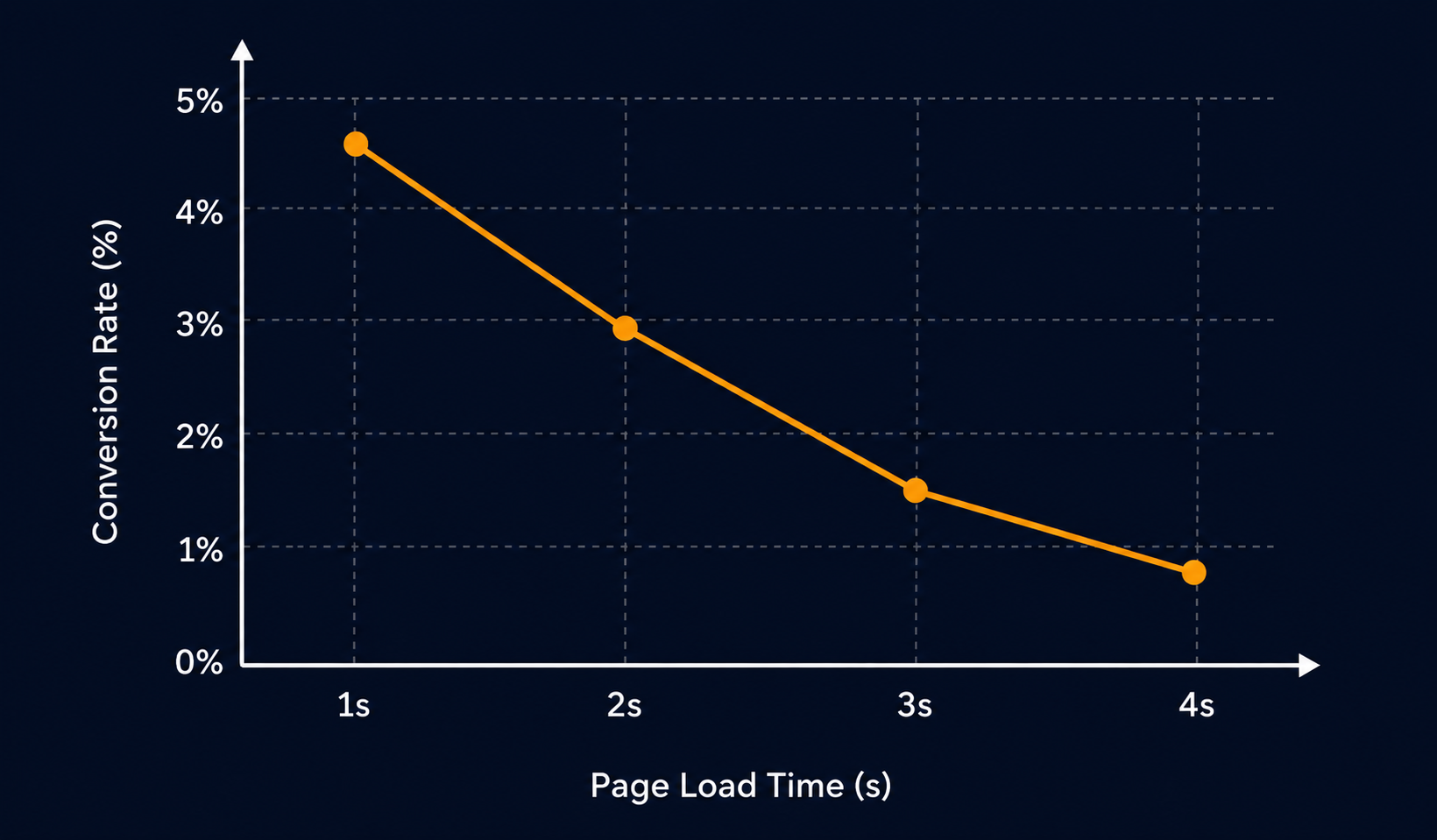
Quick wins that don't require touching the codebase:
- Compress product images with TinyPNG or use the automatic WebP conversion offered by apps like Crush.pics.
- Audit which Shopify apps load scripts on the frontend and disable the ones you're not actively using.
- Make sure images outside the initial viewport have the lazy loading attribute enabled.
- Use your store's own speed report in the Shopify Admin dashboard as your starting point, not Google Lighthouse in incognito mode.
Before hiring a developer to optimize the theme, exhaust these options first. In many cases, these alone are enough to get Core Web Vitals into the green.
Trust signals: the checklist that curbs abandonment
A first-time visitor knows nothing about you. Their brain is scanning for signals that it's safe to buy. If it doesn't find them in the first few seconds, they leave.
Trust checklist for your product page
A visible returns policy, reviews with photos and ratings, secure payment badges, a specific delivery timeframe, and accessible contact details. Missing any one of these is a conversion leak.
- Guarantees and returns: show them on the product page, not just in the footer.
- Real reviews: with a photo, a name, and a recent date. Reviews without photos convert less.
- Secure payment badges: Visa, Mastercard, PayPal, and the SSL lock icon visible near the buy button.
- A specific delivery timeframe: "Get it by Thursday the 3rd" converts better than "ships in 3-5 business days."
- Accessible contact: a visible email or chat shows there's someone on the other end.
You can go deeper on this in the pre-campaign checklist, which also covers preparing your full funnel.
Product copy that sells, not describes
The most common product description on Shopify stores is a list of technical specs copied from the supplier. That doesn't sell. What sells is the outcome the buyer gets.
Instead of "100% organic cotton fabric, 220 g/m², machine wash at 30°C," try: "The t-shirt that survives three years of washing without losing its shape, made without chemicals that irritate your skin."
The structure that works in DTC is straightforward:
- First line: the main benefit or the problem it solves.
- Brief expansion: two or three features translated into real benefits.
- Close: who the ideal customer is for this product and why it's the right choice.
Copy is CRO. It's not content marketing. It's the sales pitch at the one moment the customer is actually considering buying.
Mobile-first isn't a slogan, it's your reality
For most Spanish DTC stores, between 65% and 80% of traffic comes from mobile. Yet mobile conversion is still 30% to 50% lower than desktop. That gap is where the money is.
Check your store on an iPhone, one-handed, without your glasses if you need them. That's the experience of your average customer.
- Is the product text readable without zooming in?
- Do images load fast on 4G?
- Does checkout take fewer than four steps?
- Are Shop Pay or Apple Pay enabled for one-click payment?
Enabling accelerated checkout methods like Shop Pay can boost mobile conversion by 10% to 20% without touching a single line of code. It's one of the best effort-to-impact changes available on Shopify today.
Social proof at the moment of decision
Social proof isn't a reviews widget in the footer. It's showing the right evidence at the moment the customer is about to decide.
There are three highest-impact spots: near the buy button, in the cart before checkout, and in the cart-abandonment email. If your reviews only live at the bottom of the product page, you're wasting your most valuable social proof.
Combine formats: an average rating with the number of reviews, a featured review with a photo, and if you have social UGC, a block of real customer photos converts better than any studio photography.
To close: conversion is optimized with surgical precision, not months of redesign. Pick one item from this list, measure it before you touch it, implement the change, wait until you have enough data, then iterate. That repeated cycle is what separates stores that grow from stores that redesign without results. If you want a concrete audit of where the leaks are in your store, tell us where you're at and we'll figure it out together.

Juan Jüncter
Founder & Operator · ReadyCart
Founder of ReadyCart. Builds Shopify stores, runs Google and Meta spend, and sets up the measurement that makes every decision verifiable.
Work with ReadyCart

Get tactics like this every week
Practical content for Shopify brand owners who want to grow with strategy, not luck.